

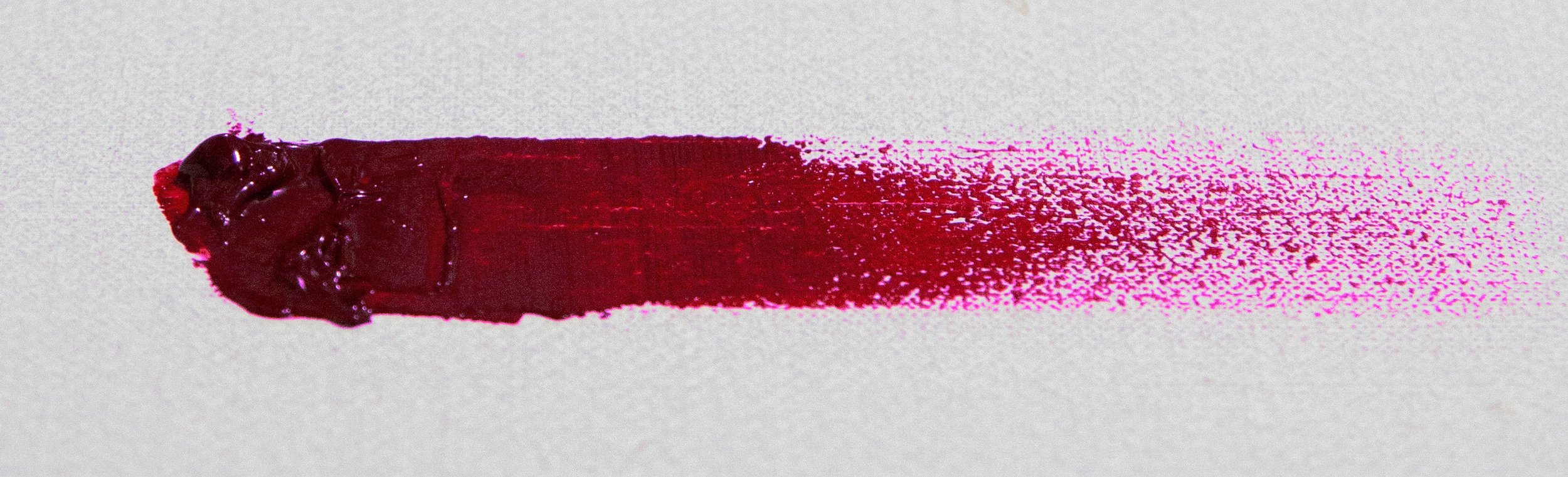
In my earlier days of artistic development, I avoided subjects with colors that I felt were impossible to recreate using paint. Flowers that were deep fuchsia seemed so daunting and always turned out either too desaturated or overly red whenever I mustered up enough courage to attempt them.
The truth is, while color itself is only one of the elements in a painting (the others being drawing, value, edges, and composition), it’s an important factor if you’re trying to accurately render something as vibrant as a flower; and if your palette isn’t equipped with certain pigments, certain subjects will always be just beyond reach.
Now that I’m a bit further along on my journey, I’ve found that there are some lovely pigments being manufactured, which allows me to paint even the trickiest magenta-colored flowers!
MY CURRENT FAVORITES:
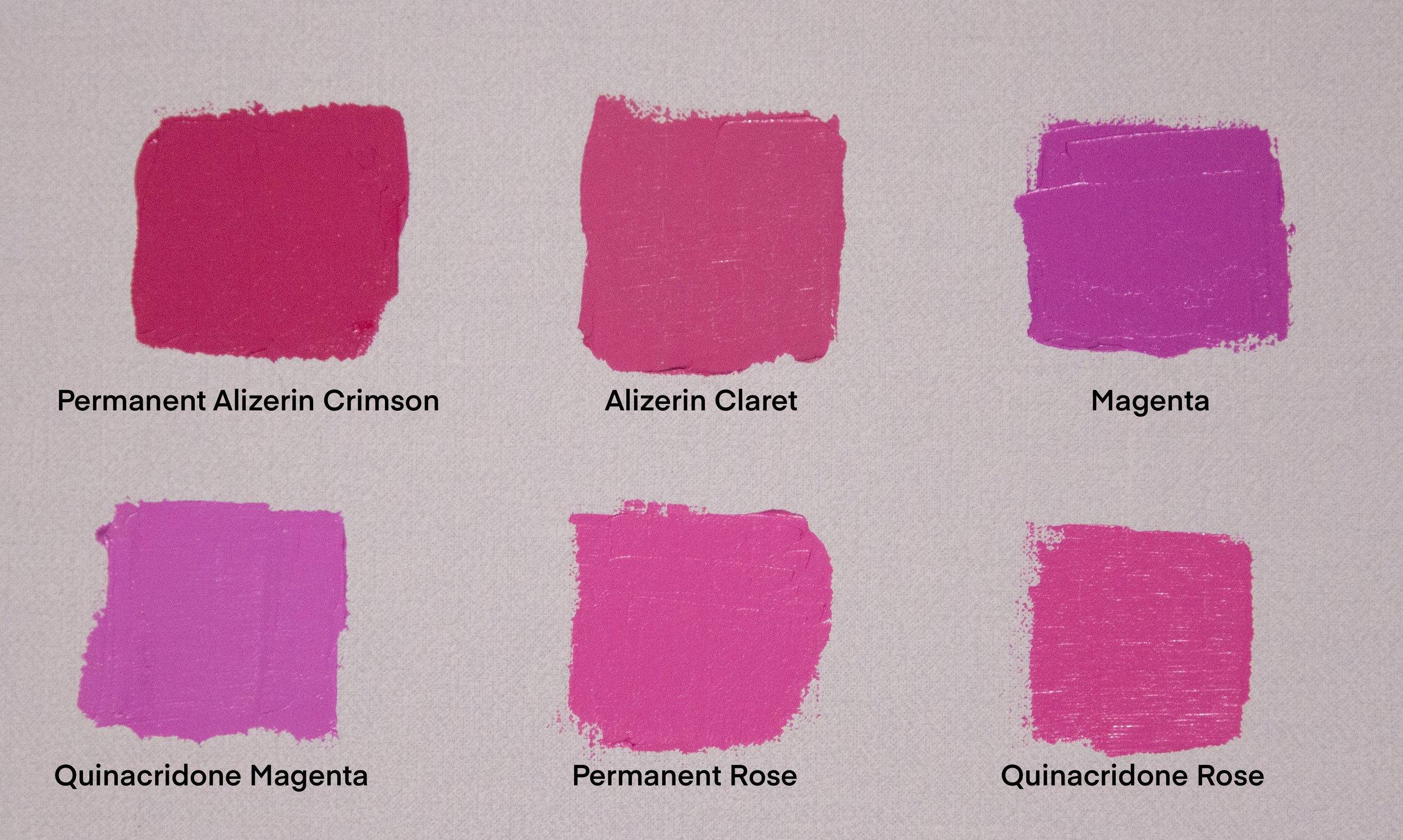
Permanent Alizerin Crimson - Winsor & Newton
Alizerin Claret - Michael Harding
Magenta - Michael Harding
Quinacridone Magenta - Winsor & Newton
Permanent Rose - Winsor & Newton
Quinacridone Rose - Michael Harding
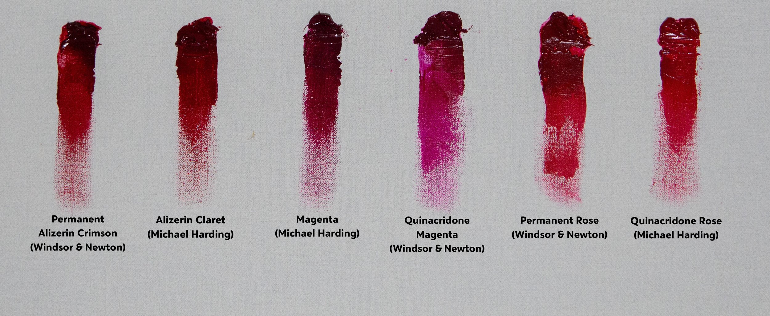
This is by no means an exhaustive list of what’s available, nor are they the only pigments that will work for painting flowers, but rather what’s currently in my studio and on my palette. The best thing to do is experiment and try whatever you think might work.
Some qualifications for making it onto my “try” list:
Lightfastness
We’ve likely all heard about “fugitive” colors, such as the original Alizerin Crimson - fugitive colors fade over time, and some lose their color completely! So consult the paint-tube label for information about the specific pigment’s lightfastness.
Permanence
Often used interchangeably with lightfastness, permanence can refer both the paint’s ability to withstand normal UV light conditions and hold-up over time in normal indoor conditions. Hopefully, this also means that it won’t severely crack or flake later on, but each manufacturer has their own definition about what “permanence” means. Better safe than sorry, so I always use colors that give the highest permanence ratings on their labels.
Single Pigment
This is a particularly important qualification for me, as I like the ability to mix high-chroma colors and not end up with a desaturated “muddy” mess. The loss of chroma occurs as each additional pigment is introduced to the first, and if I add enough of them together, I’ll end up with a dull gray-brown color. If the tube is comprised of several pigments (and many of them are), when I attempt to mix it with another color, it quickly desaturates. To avoid this, I simply ensure that whatever makes it’s way home with me, is a single pigment color.
Tinting Strength
A color’s tinting strength isn’t always evident just by unscrewing the tube’s lid in the art store (something we ALL do, despite the signs that tell us not to), and they’re often so dark that it’s difficult to know the nuances of it immediately, so this is something you’ll have to test in the studio. Simply mix a bit of the color with white (titanium in this case) and the specifics of the pigment will become clearer to you…

Example of magenta roses using the various pigments listed